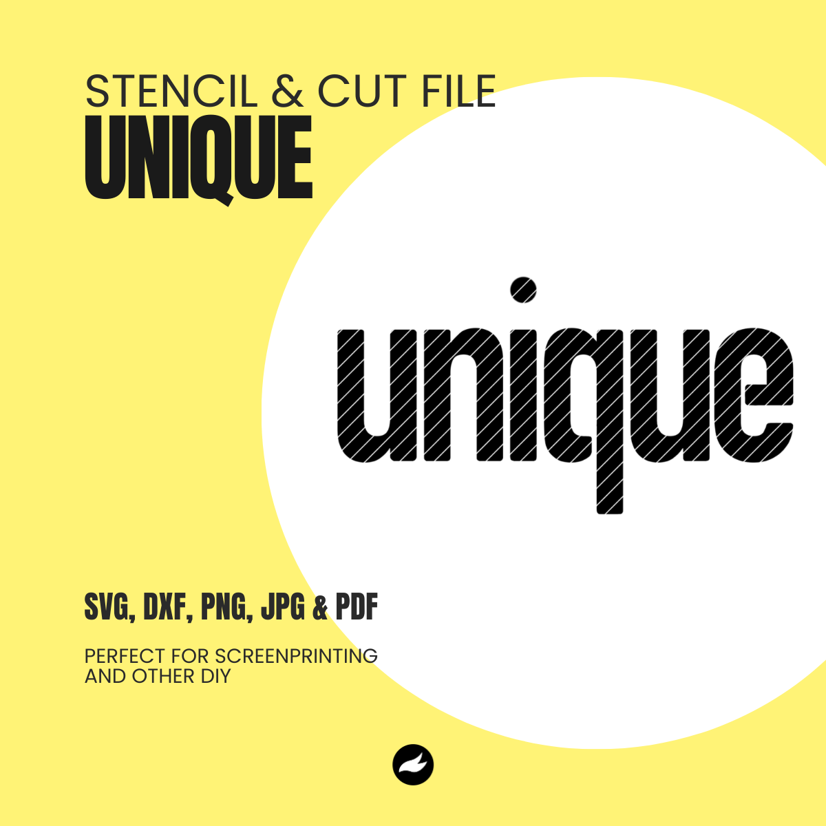
unique – duo color overlay
Share
Looking for a way to make your screenprints more dynamic? A duo-color overlay is a subtle but powerful technique to give your prints depth and character—without adding complexity.
Here’s how to do it at home using simple stencil tools.
Step 1: Print the Base Layer
Start by printing the background layer as usual. Keep in mind that you’ll need to shift the stencil slightly to the right—this compensates for the extra space that will later appear between the two overlay layers. The total width of the final design will be:
[Width of stencil] + [distance between the letters “u” and “e” in the overlay]
Step 2: Let It Dry
Allow the base print and your screen to dry fully. This is important for sharp overlay results and avoiding smudges.
Step 3: Align the Overlay
Now comes the magic. Shift the stencil slightly left—just enough so that the previous print barely peeks through at the edge of the letters (especially on the right). Then nudge it back slightly to the right so there’s a subtle space between the first and second layer.
This space creates the duo-tone overlay effect that looks intentional, modern, and bold.


Optional: Try Contrasting Colors
Overlaying a lighter second color on a darker base can create a glowing effect. Invert it for a shadowed look. The creative possibilities are endless, even with just one stencil file.
Bonus Tips:
- Try the colors before you get stared - not just whether the combination works, but also whether the lighter or darker colour should be on top.
- This technique works beautifully with bold typographic stencils or graphic elements like outlines, shapes, or numbers.


Want to see it in action? Watch the Instagram reel.
Got a question? Reach out anytime—we’d love to see what you create!

